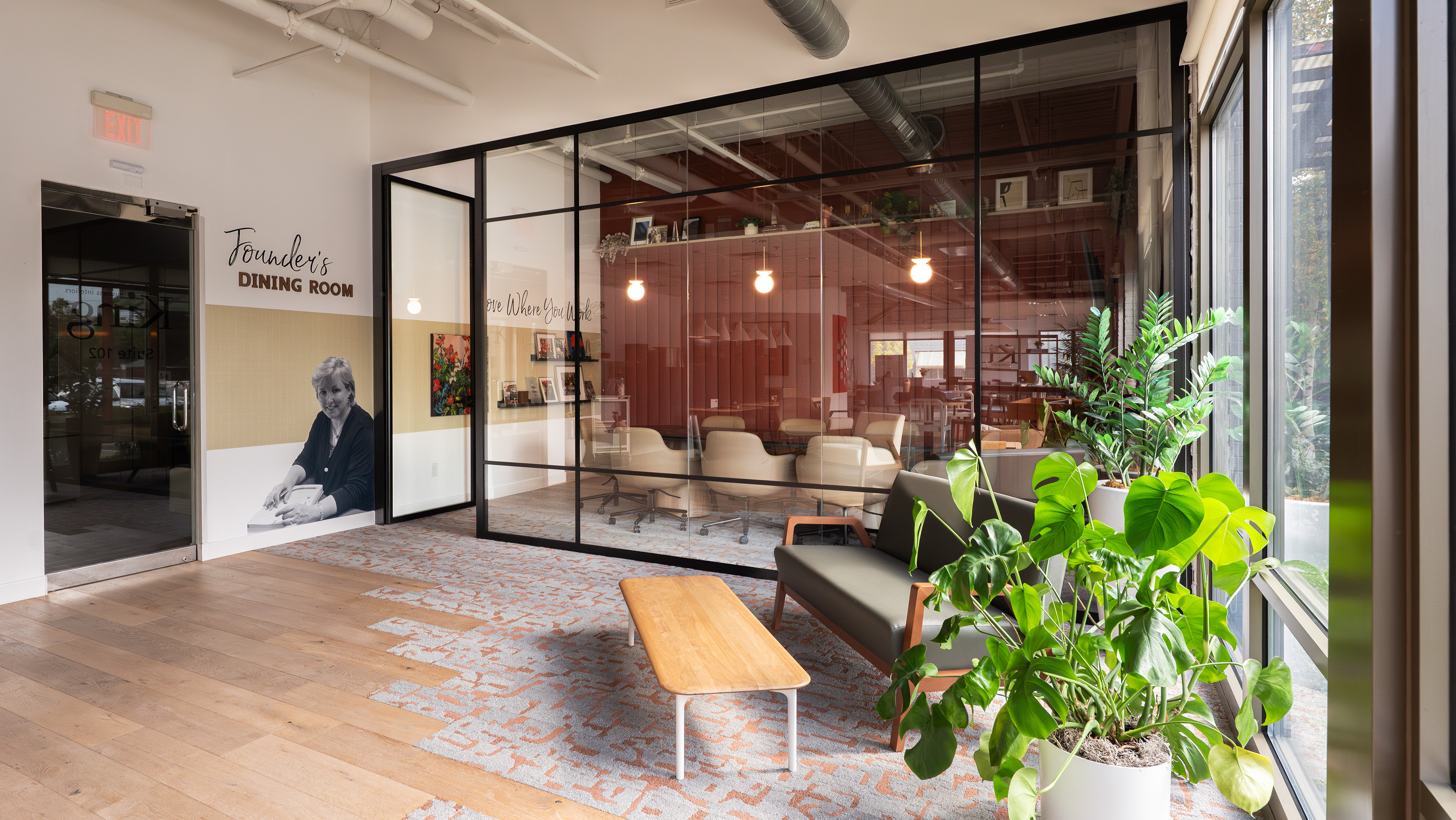
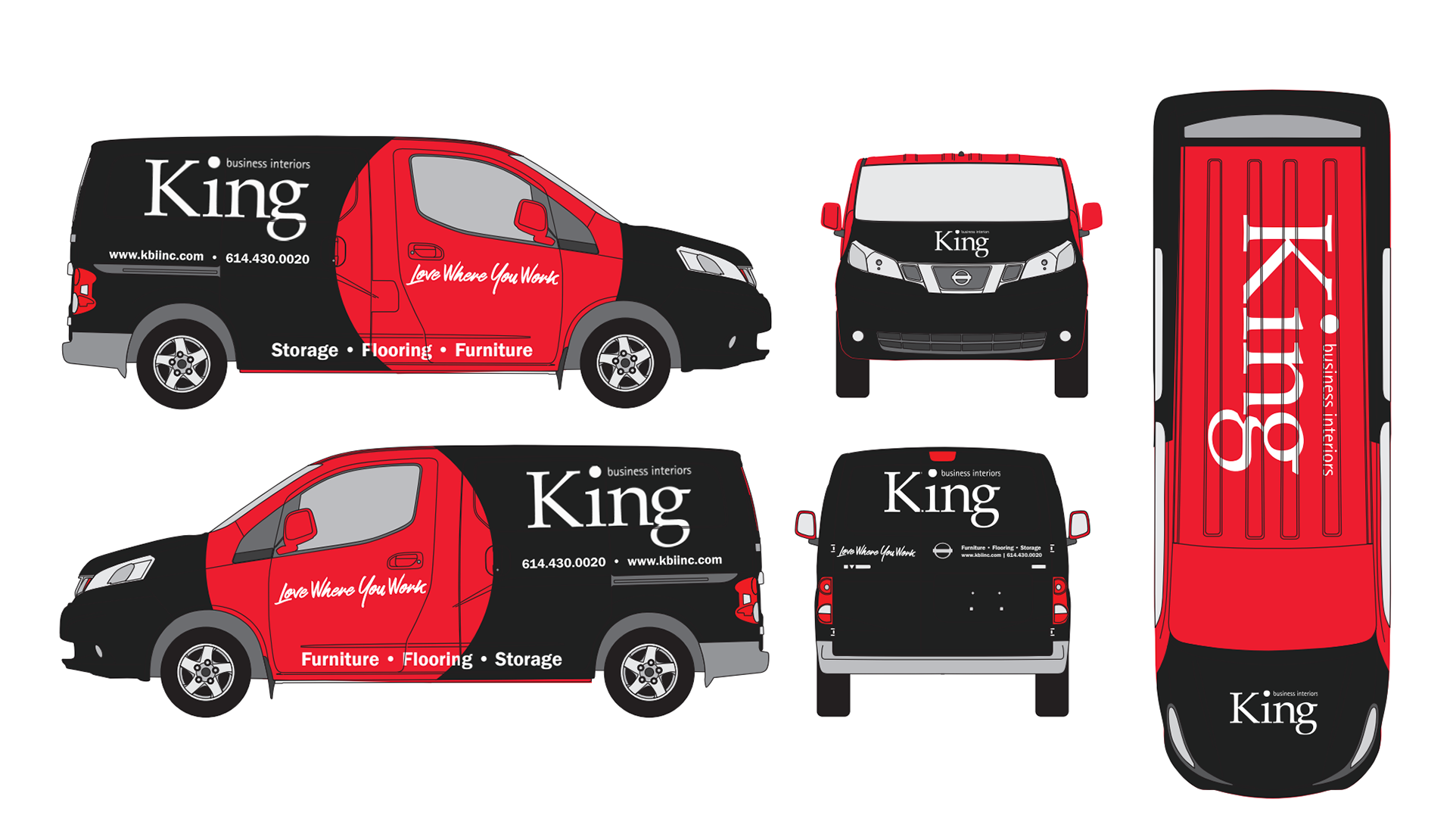
King needed to update their fleet to reflect their new branding and requirements from their main manufacturer. My goal was to create simple graphics that would catch someone’s eye while they sat in traffic, would fit the updated brand standards, and remain evergreen.
Process:
For both the new van and Truck graphics, I wanted to utilize negative space to reduce the printing cost of the vehicle wraps and utilize the King brand red without the color being as overwhelming as the old design was.
Designing the van first, I started by sketching out ideas that spotlighted key brand elements in pops of color. Since King would need to re-wrap 10 vans, I aimed to create a design that would only require wrapping half of the van to help meet their limited budget. I picked my three favorite concepts to further develop and present to King leadership.
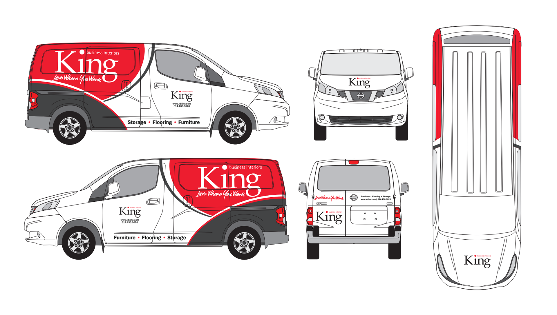
Van Graphics: Option 1
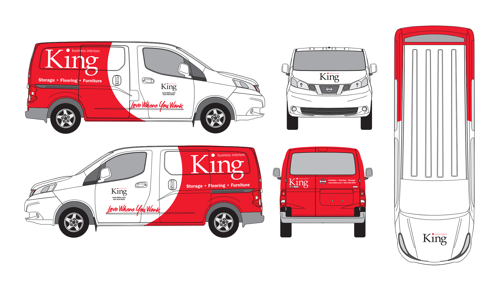
Van Graphics: Option 2
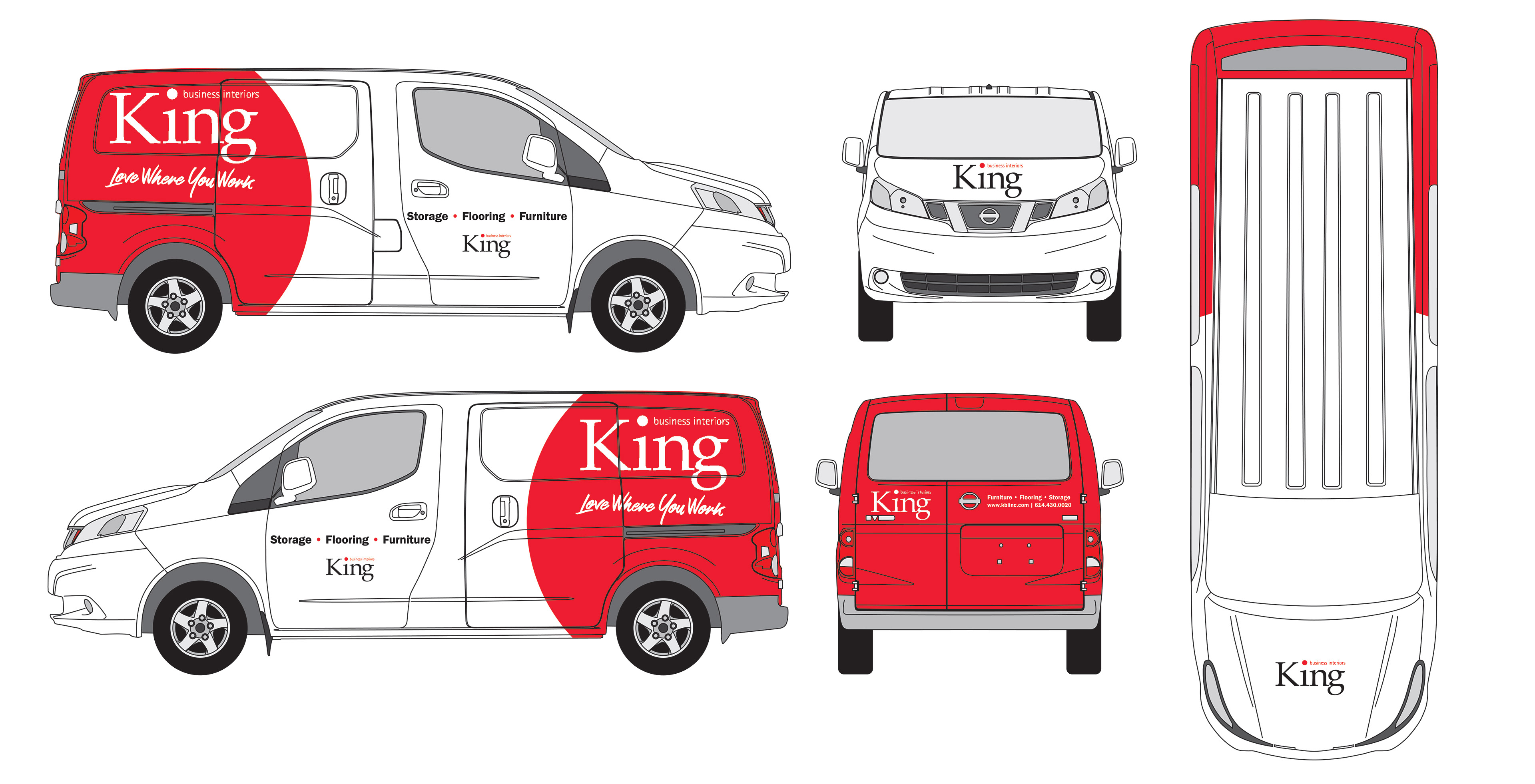
Van Graphics: Option 3
After reviewing the three van concepts, King's leadership team asked me to revise the option three mock-up further. To help refine the design and to bring in a subtle brand element, I inverted the curve of the red element to create a shape that mimicked the dot of the i in the King logo.
This design was ultimately chosen by the leadership team and will be installed on their fleet over a period of three years.
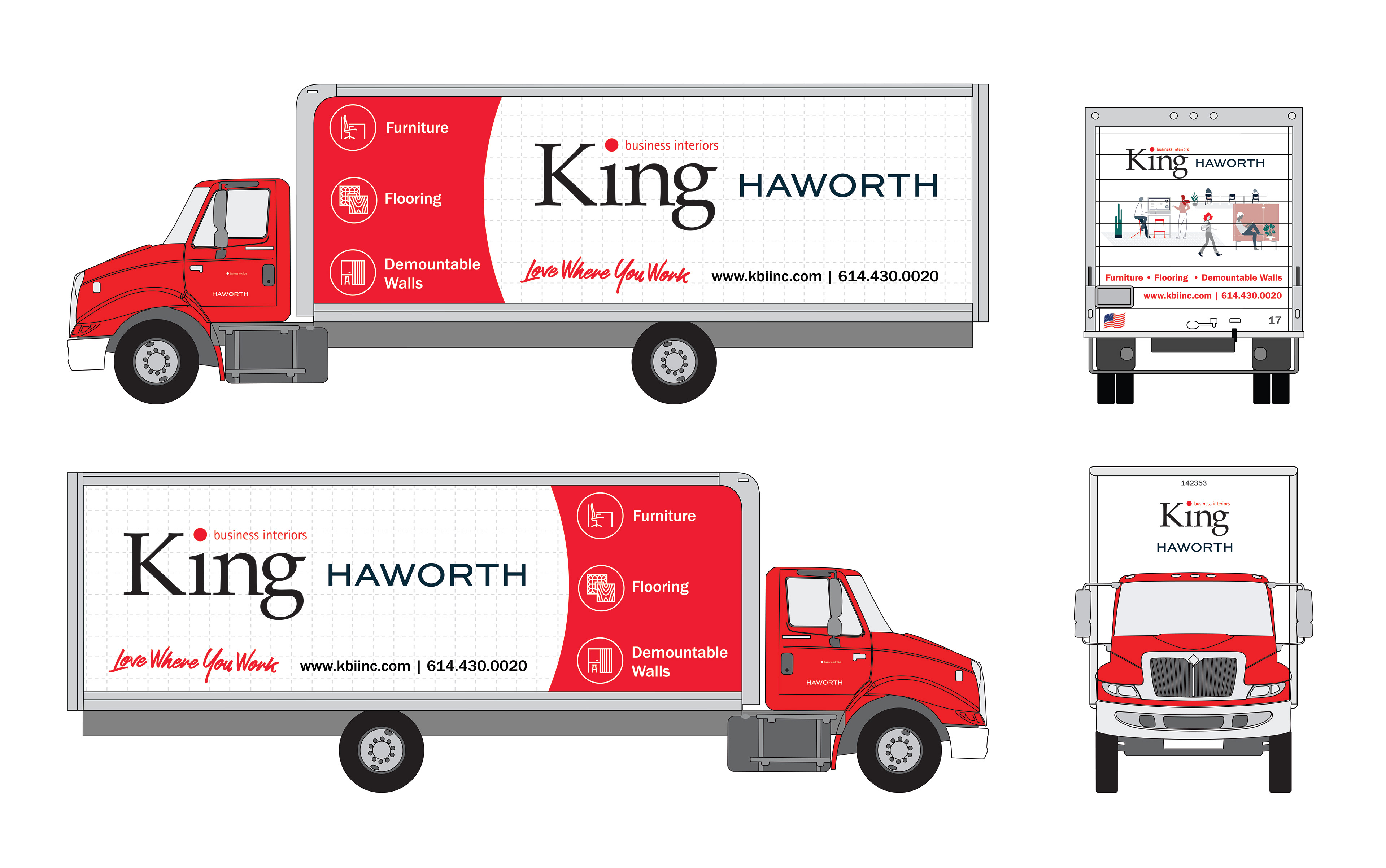
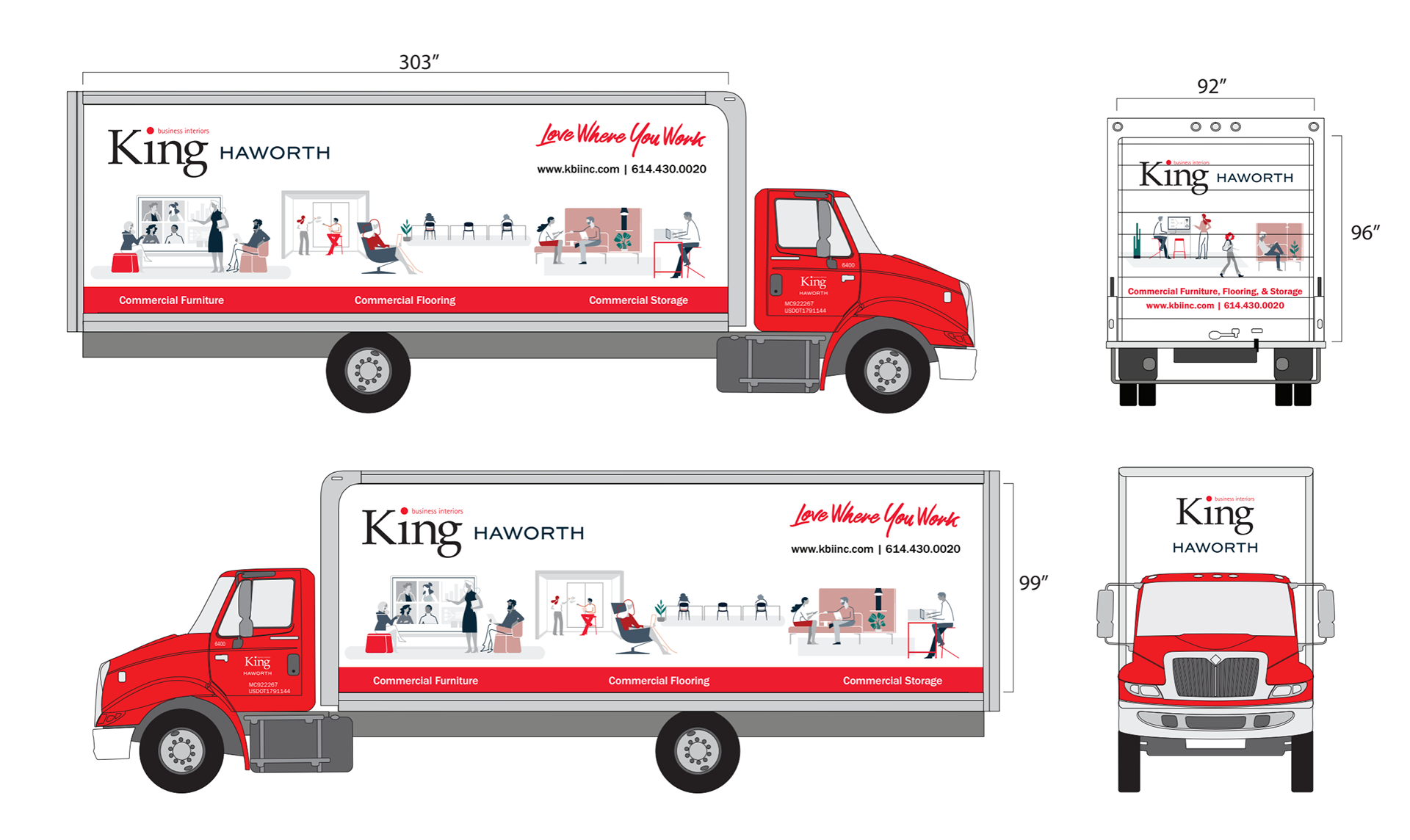
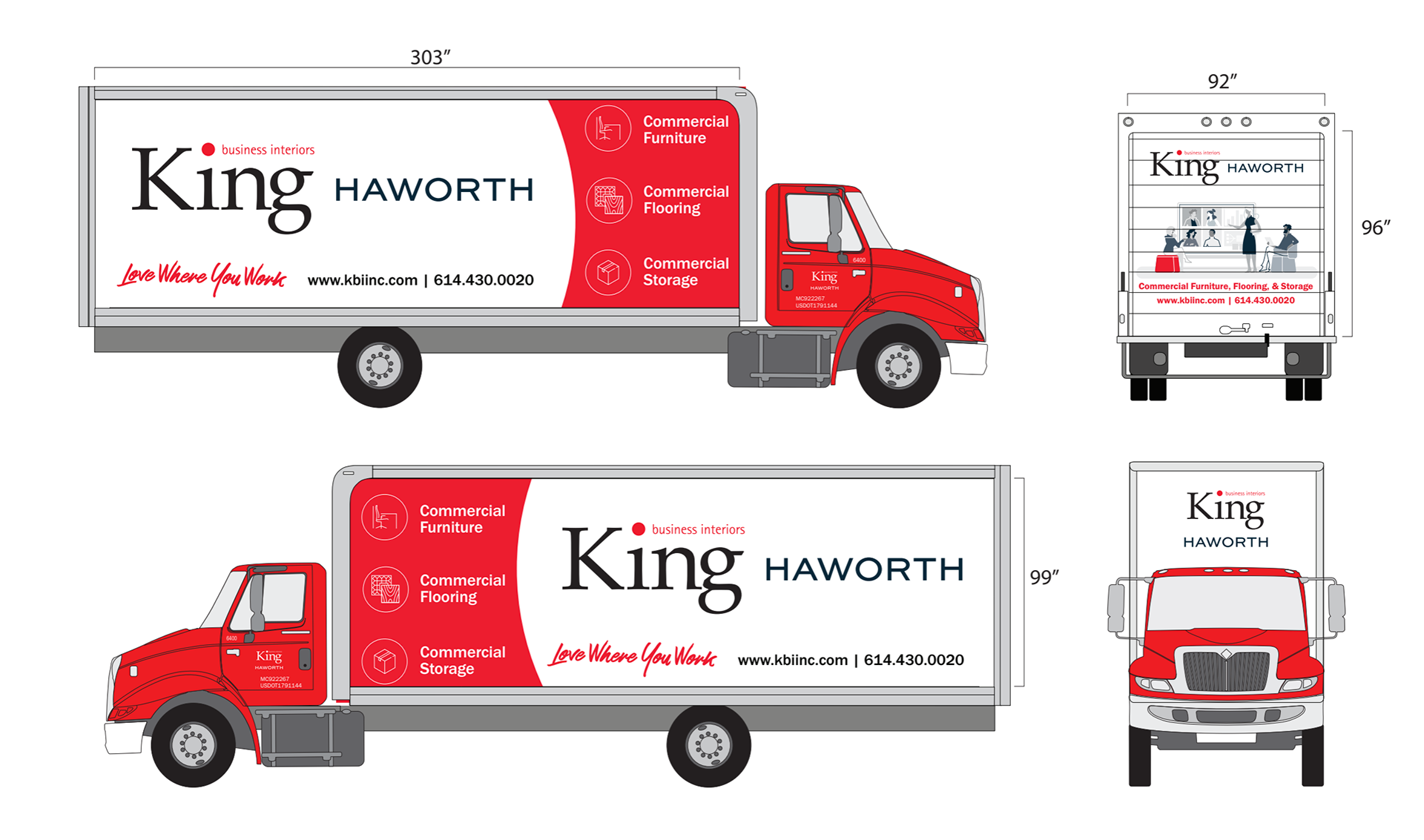
After completing the design of the van graphics, I turned my attention towards the delivery trucks. Part way through the design process, King's main manufacturer required that their logo be included on the trucks and had strict guidelines on the spacing that impacted my original design intentions.
I went back to the drawing board and mocked up three options for the leadership to review. Two of the design options had negative space elements similar to the vans and the other highlighted an illustration style used on other marketing.
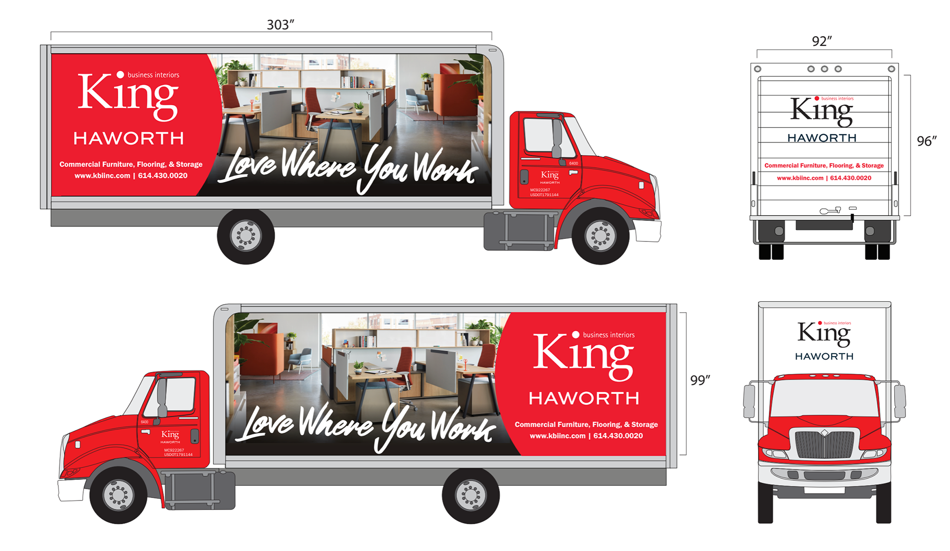
Truck Graphic: Option 1
Truck Graphic: Option 2
Truck Graphic: Option 3
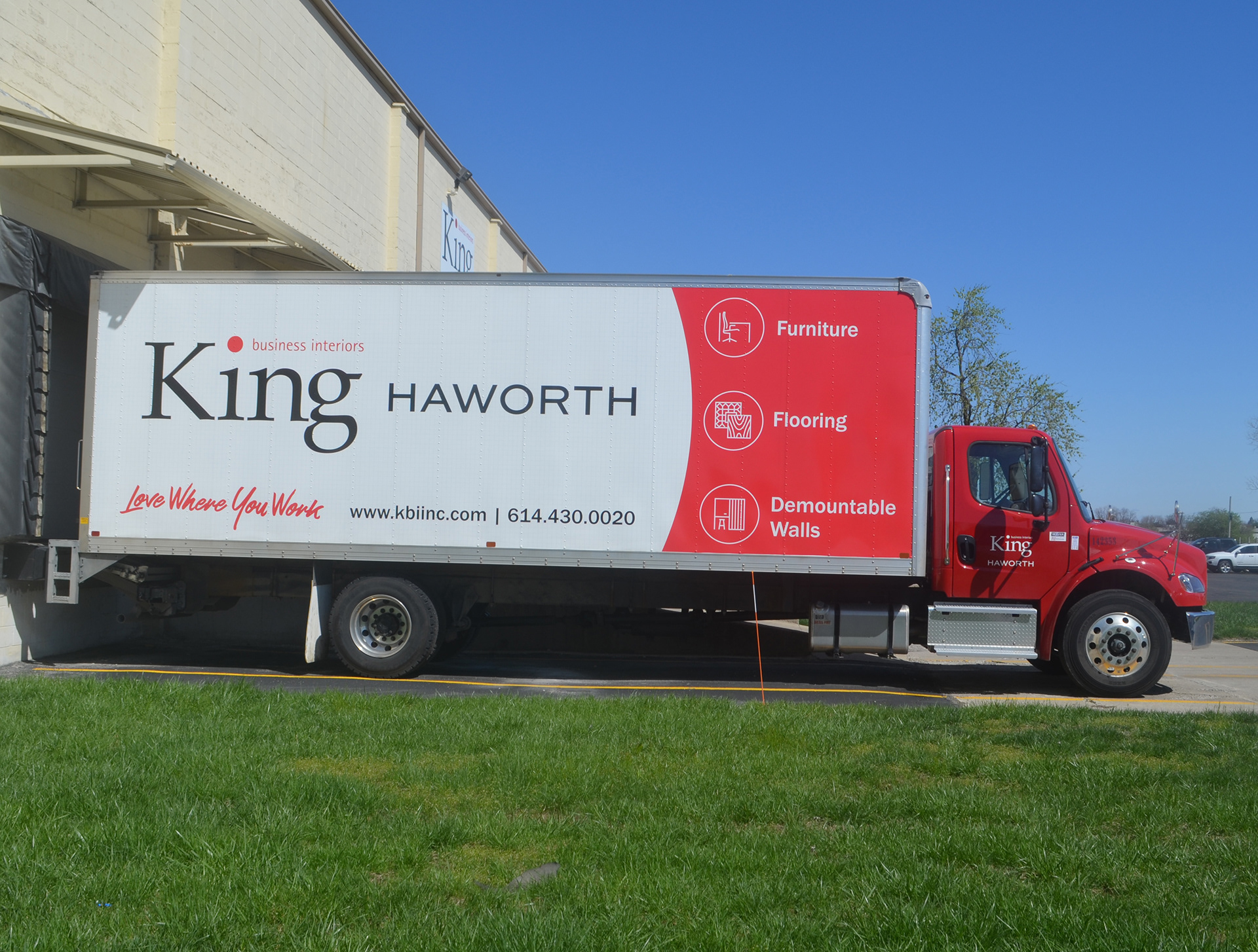
After adding in the brand grid to option three, leadership chose to move forward with the revised option three. This design will be rolled out to the rest of their delivery trucks over the next five years.